When you’re creating artwork for print – whether it’s a flyer, business card, poster, or brochure – it’s easy to think that the best approach is to maximise every inch of space. After all, you’ve paid for the full size, so why not make sure you get your money’s worth?
The truth is, filling every corner with text and images doesn’t always work in your favour. In fact, leaving some breathing space can make your design look sharper, more professional, and easier to read. At Replica Print, we see a lot of artwork come through our doors, and we know from experience that the best results often come from designs that aren’t afraid of a little empty space.
The Problem With “Edge to Edge” Content
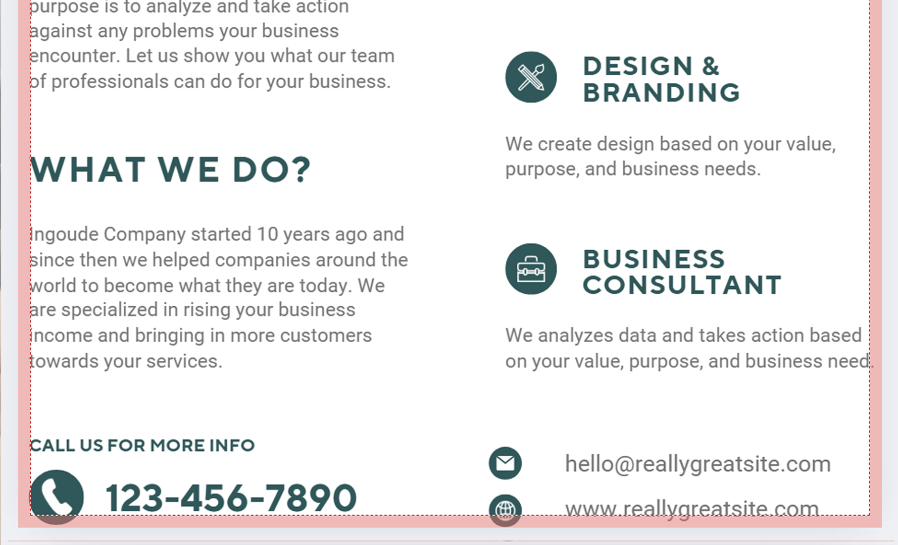
One of the most common mistakes we see is when important elements – such as phone numbers, website addresses, or logos – are placed right up against the edge of the artwork. While it might look fine on screen, it can cause two big issues once it’s printed:
- Risk of being cut off
Every printed item has to be trimmed down to size. Even with the most accurate machinery, there’s always a tiny tolerance in trimming. If your text or image is too close to the edge, there’s a good chance it will end up looking uneven, or worse – sliced right through. - Harder to read
When everything is pushed up against the margins, your design looks cluttered and overwhelming. Readers don’t know where to look first, and important messages get lost in the noise. - Unprofessional appearance
Think about the last high-end brand you saw. Did their adverts, packaging or magazines cram in every possible detail? Probably not. Clean design with good margins instantly looks more premium and trustworthy.
The Role of “Safe Zones” and Bleed
In printing, we work with two important concepts: safe zones and bleed.
- The safe zone is the area inside your artwork where you should keep all the important elements like text and logos. We usually recommend leaving at least 5mm between your content and the edge. This ensures nothing essential is lost in trimming.
- The bleed is the extra area you extend your background colour or image into – usually 3mm past the trim edge. This ensures there are no unwanted white lines if the trim is slightly off.
By respecting both the safe zone and the bleed, you’ll end up with a print that looks balanced, polished, and free from nasty surprises.
Why White Space Is Your Friend
Designers often talk about “white space” – the blank areas around your text and images. But don’t let the name fool you. White space doesn’t literally have to be white; it just means uncluttered space that gives the design room to breathe.
Here’s why it works:
- Improves readability – the eye can move more naturally across the page.
- Focuses attention – your message stands out when it’s not competing with other elements.
- Creates a premium feel – minimalist layouts often feel more stylish and confident.
In other words, white space isn’t wasted space – it’s an essential part of good design.
Real-World Example
Imagine two business cards. One is packed with logos, bullet points, contact numbers, a tagline, and even a small photo of the office. The other keeps things simple – just a name, role, phone number, email, and logo, with plenty of breathing space.
Which one would you rather hand over at a meeting? Which one do you think the person is more likely to actually keep?
Less information, presented clearly, will always have a bigger impact than cramming in everything at once.
Our Advice at Replica Print
When you send artwork to us, we’ll always double-check it before it goes to print. If we spot text too close to the edge, we’ll let you know. We’d much rather take the time to make adjustments than let you end up with a batch of prints that don’t look right.
So next time you’re designing a flyer, poster, or business card, remember:
- Keep important details at least 3mm away from the edge. 5mm for smaller artwork like A6 flyers
- Add a 3mm bleed if you’re running colours or images to the edge.
- Don’t be afraid of white space – it’s what makes designs easy to read and professional looking.
By following these tips, your print won’t just survive the trimming process – it’ll stand out for all the right reasons.
If you need help with design, contact us or visit our size guides blog with Canva links


